

<yawn> Media Lies Visually Every Day </yawn>
What sorts of people make these misleading news graphics to shock the Olds?

I am back from a business hiatus in publishing longform Tweets here. I have been shaken out of my writing complacency by this particular irritating kind of visual lying that I have mentioned previously in “science” “journals.”

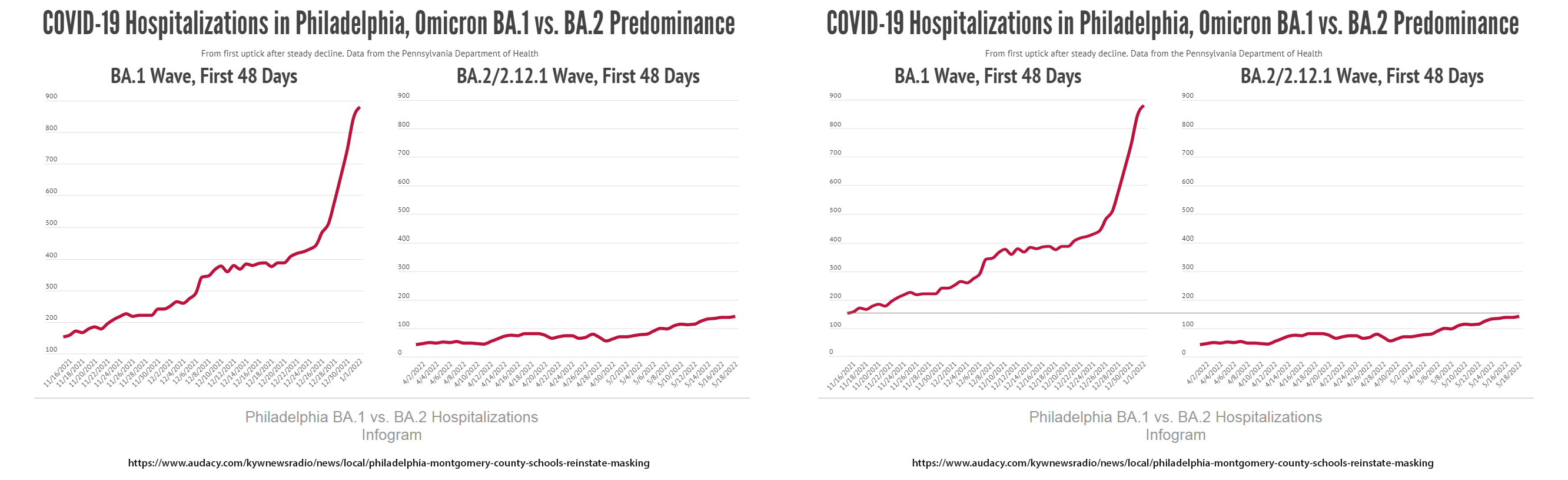
It is ye olde oddscaling comparative graph. Why did this one catch my eye and piss me off? I have a certain close female from the Greatest Generation (mom) who was bamboozled by a sharp upward Rona hospitalizations curve she saw online. I eventually coaxed a link from her so I could see what she was talking about. I placed the link in the following images so you can type in and follow along if you want (on the page I viewed it was at the bottom), but I am not super interested in giving them traffic. If you trust me at all you will know what I will say here is true to the pixel.
She was at first reacting to a hockey-stick type graph but because the dates along the x-axis were so tiny, she couldn’t make them out. (Nice ableism, journos.) I calmed her down and said “Those are from Q4 last year, 2021, around Thanksgiving and Christmas.” “Oh. And so what does the the flatter graph mean?” “Those are more recent Q2 numbers, ending about a week ago.” She says: “Oh no! we are already starting a new wave?! That’s what they called it, a `WAVE`! I mean look, the graph is above the same level we were at in November!”
Calmly, mom. That is what they want you to think. They think you and people in your age group are a little too relaxed about viral threats these days. They will soon be using the seasonality uptick of COVID to get you to mask up and go find a booster clinic, but mostly to give you a much-needed fear injection that keeps them in power.
“Are you worried about ‘Monkey Pox’ yet?” (This btw is the most racist term I have ever heard for an African virus that actually reservoirs in rodents, but who ever said journos aren’t racists?) “Oh yes, it’s another outbreak that is coming to America right now!” “No. It is a fundamentally homosexually-transmitted disease like HIV and it currently affects about 50 people worldwide who went to a gay pride party or two in Europe and had a lusty viral friction orgy. Does that describe you or anybody you know?” “No.” “So relax, sweep that off your mind and tell 2 friends who will tell two friends. Remember how Anthony Fauci cocked up (lol) the AIDS handling in the 1980s and we all didn’t die except a few bathhouse-frequenters of the extremely promiscuous variety? Same thing.”
Back to the graphs. Please allow me to point out the devious way they structured the imagery to display in-browser. They made it so that the images did not display in-full, top-to-bottom. One needs to scroll up and down to get an idea of what the graph says. It is like playing blindman’s bluff. Eventually it gets frustrating and boring and you are left with the quick-hit that “Holy Gawd look at that case spike! We are in deep now!” And then they offer you short video clips of Kylie Jenner’s nearly naked glutes which is just drooling ADHD fodder, and 80% of readers trot off to see the skin…but they now know that Rona is back. Or at least the seed is planted.
The best I could do with this image zooming in on it, was to see about 27% of it at a time, so I did 4 screencaps in scrolling sequence and carefully (to the pixel) stitched them together for what you see above in one shot. I eventually sent this to mom for discussion.
See if you can see the issues. Apart from some petty nudges amounting to about 6 pixels, always conferring benefit to the needs of The Narrative (it is not accidental), the overarching message here is that something explosive is happening or has happened. (Here is where you should freak out.) That was the mommo big takeaway. The second message for those who care less about Kylie callipygianism who somehow saw the maximum of the right graph already rising well above the initial point of the left graph is: The End Is Near, Here It Comes Again. (Also freak out here.) But did it really say that?
No. The truth is that the Q4 left graph start is about 3X more than the Q2 right graph maximum. Read that again. Q4 starts it’s “zero” at 100 cases, and the Q2 is actual zero (0). Q4 starts at 150. Q2 starts at under 50. I am not lying. Q2 maxxes out at maybe 140 cases, actually under the Q4 start. Rather than being a hypemachine that they intended it to be, this graph set should be calming and reassuring that after 48 days, log phase growth in transmission isn’t happening.
This is some sussy stuff these people pull on the reg. I wish my people were more enthusiastic about pushing back on being lied to in such a way.
The last two years has made buying gifts much easier. I will be getting relatives a copy of How to Lie with Statistics for every holiday and special occasion.